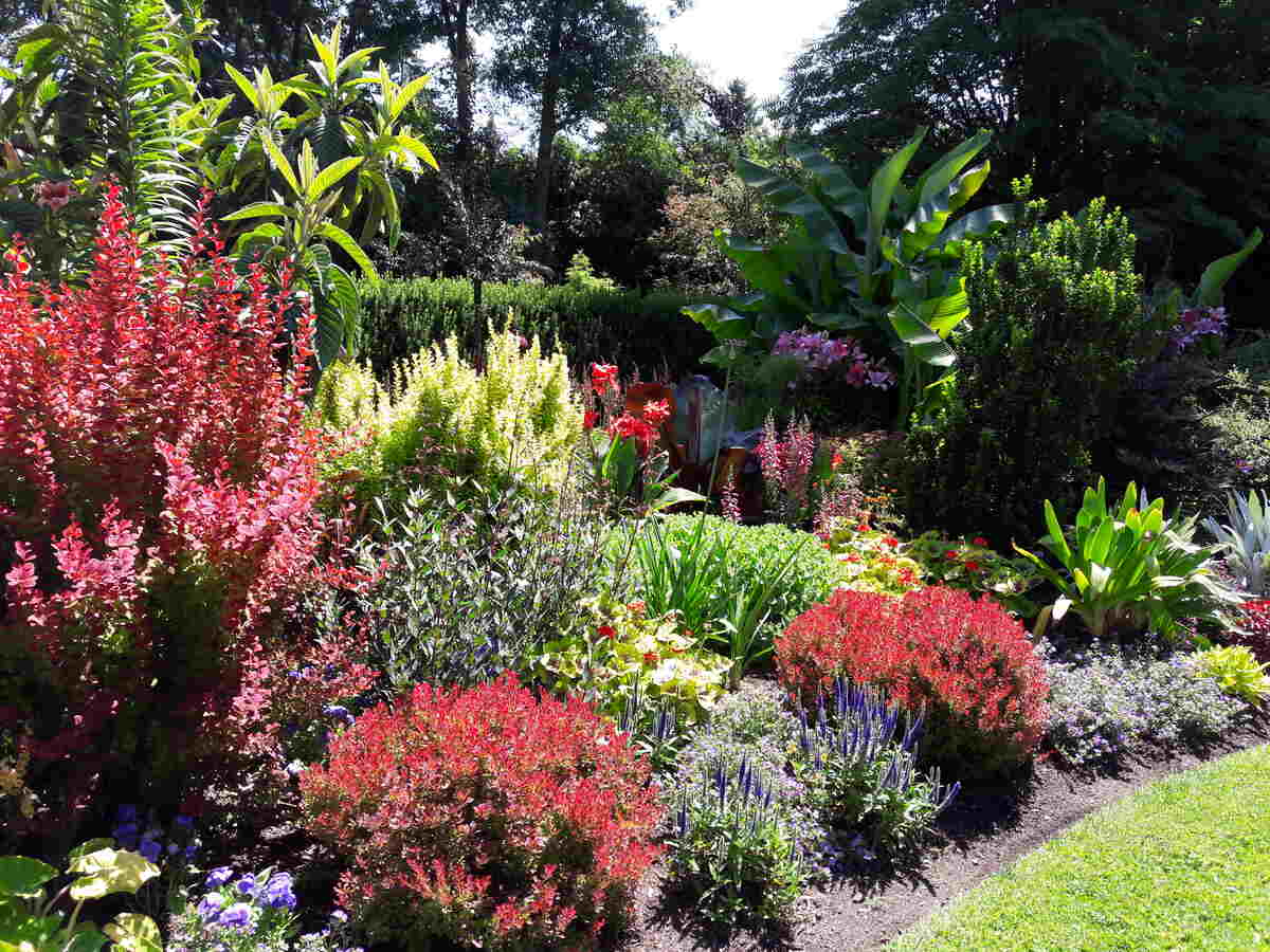
If you’ve just planted a bed of roses next to a cluster of tulips and something doesn’t look right, it might be time to explore color theory in your landscape design. In this article, we’ll dive into color theory, how it affects your perception, and how to landscape with color theory.
The Principles of Color
Primary Colors
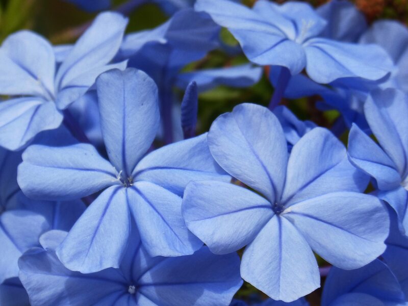
All colors are created from the three primary colors: blue, red, and yellow. In color theory, you combine the primary colors to make both secondary and tertiary colors.
Secondary Colors
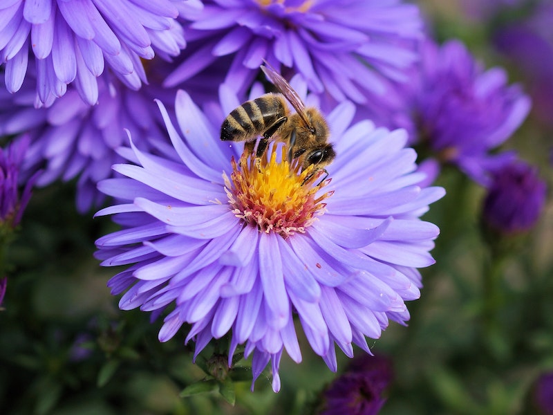
This part is easy (you probably remember it well from art class). Mixing two primary colors creates a secondary color. The secondary colors are purple, green, and orange, and they are created like so:
- Purple (mix blue and red)
- Green (mix blue and yellow)
- Orange (mix red and yellow)
Tertiary Colors
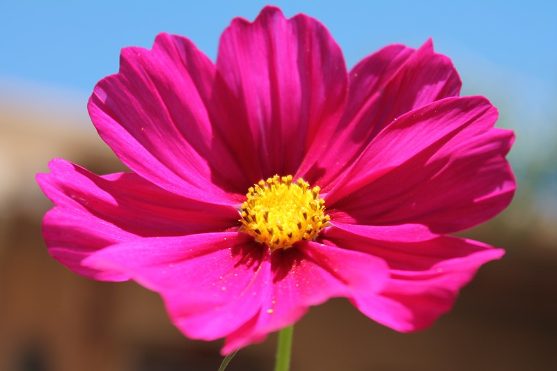
Just like the Latin root of the word, this type of color takes one of the primary colors (blue, red, or yellow) and one of the secondary colors (purple, green, or orange) to create a third tertiary color. Some examples of tertiary color combinations include:
- Magenta (mix red and purple)
- Vermillion (mix orange and red)
- Charteuse (mix yellow and green)
The Color Wheel
All of these principles of colors exist within what’s known as the color wheel. It displays how the primary and secondary colors combine to create a spectrum of color in a logical order. Visual artists and other creators utilize the wheel to find complimentary and cohesive colors for design elements in their work.
Fun fact: Sir Issac Newton created the color wheel.
The Shades and Tints of the Color Wheel
Understanding the difference between a shade and a tint and how to properly apply it drastically changes the impact and focal points of your landscaping.
A shade is when you darken a color by adding black. An example of a shade would be navy is a shade of blue.
A tint is when you lighten a color by adding white. An example of a tint is pink is a tint of red.
How to Use Color Theory in Landscaping
While color theory gets complex and lengthy, you don’t need to become an expert to understand what’s appealing to the human eye and brain. The rules of color theory enhance features of your yard, like hardscapes, water features, and natural elements. Simply getting the basics of color makes utilizing color theory in your landscaping much easier and more cohesive.
Complementary Colors
When looking at the color wheel, you’ll find complementary colors across from each other on the wheel. When you utilize complementary colors, you create a high contrast feature in color theory. Examples of complementary colors common in landscape and garden design include:
- Yellow and purple
- Green and red
- Orange and blue
Primary Colors
This color combination in landscaping is eye-catching and modern. Pairing red, yellow, and blue gives you or anyone else viewing your outdoor space a little taste of all the groups of colors as they contrast against the primary and tertiary colors of your landscape. Primary colors in landscaping appear bright and have a high visual impact, especially when surrounded by greens.
Monochrome Colors
If you’re particularly passionate about all things pink, try adding monochromatism to your landscaping. Monochrome colors are shades and tints of the same color. Playing around with a monochromatic color scheme ranges from anything like red roses, red salvia, and poppies in the same yard to various types of succulents in different shades and tints of green. Satisfy your favorite color palette with monochrome colors.
Analogous Colors
On the color wheel, analogous colors are right next to each other, like a blue-green. They’re colors that fade into the next in a logical order. People tend to associate analogous color patterns with a calming and warm effect. Combining red, orange, and yellow flowers and plants will create a sunny and serene analogous color pattern in your outdoor space.
Using Color to Alter the Quality of Space in Your Landscape
Did you know that mixing and matching colors in your landscaping changes your perception of the actual space? When dealing with limited space, you’ll want to avoid color patterns that make an area feel cramped or crowded. Some common examples of colors affecting the quality of space include:
- Cool colors like purple, green, and blue tend to expand your sense of space. That’s because we perceive them as being further apart from each other. Using flowers and plants that are cool in color extends your sense of space and is perfect for a small backyard patio.
- Warm colors are perceived as being closer together. A warmer swatch of colors in your garden beds will tighten the feel of a space, creating a cozy feeling. It’s good to consider if your outdoor space feels like there’s much room to fill.
Note: Neutral colors are not considered warm or cool in color theory. But adding a pop of color, like bright red roses, to a neutral space also increases the perception of size in a space.
Benefits of Color Theory in Your Landscape Design
Planting colorful flowers and other vegetation can have special benefits for your home. These include:
- Highlight a particular space or object with the right color patterns
- Redirect attention from unsightly or imperfect areas of your garden or outdoor space
- Attract eco-friendly pollinators like hummingbirds, butterflies, and bees
- Add a touch of practicality by planting colorful edible flowers
- Balance the sense of space in your yard whether you want it to appear larger or smaller
How Light Changes the Perception of Color in Landscaping
Of course, light has its own theory and spectrum to learn. But to relate it to landscaping, playing with lighting elements also affects the perception of color as it alters whatever it touches depending on its glow.
Bright yellow lights and full sunlight highlights warm colors in your landscape. At the same time, it diminishes the appearance of soft pastels and dark colors. In fact, in low light conditions, warmer colors look duller.
Keep in mind that as the year goes on, the appearance of light changes. Whether that’s shorter days with darker nights or long days with brighter mornings, you might need to consider the position you’re planting things in so they remain as harmonious as possible all year long.
Flower Ideas by Color
Not sure what flowering plants to grow based on your favorite colors? We’ve compiled a short list of flowers based on their color. Using the color theory design principles above, you can begin thinking about the patterns and color types that work best for your tastes and space.
Keep in mind that there are often different colored versions of many of these flowers. An easy tip is to specify the color while searching for flowers, specifically for roses, carnations, tulips, poppies, pansies, peonies, orchids, and hydrangeas.
Red flowers
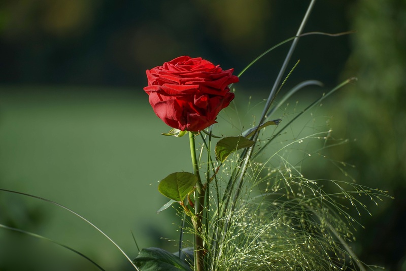
- Roses
- Poppies
- Carnations
- Tulips
Orange flowers
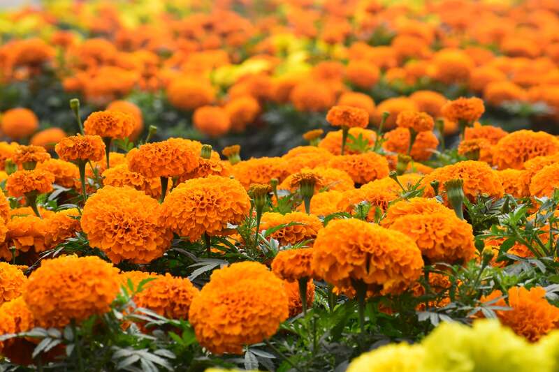
- Tiger lilies
- Marigolds
- Birds of paradise
- Orange gerberas
Yellow flowers
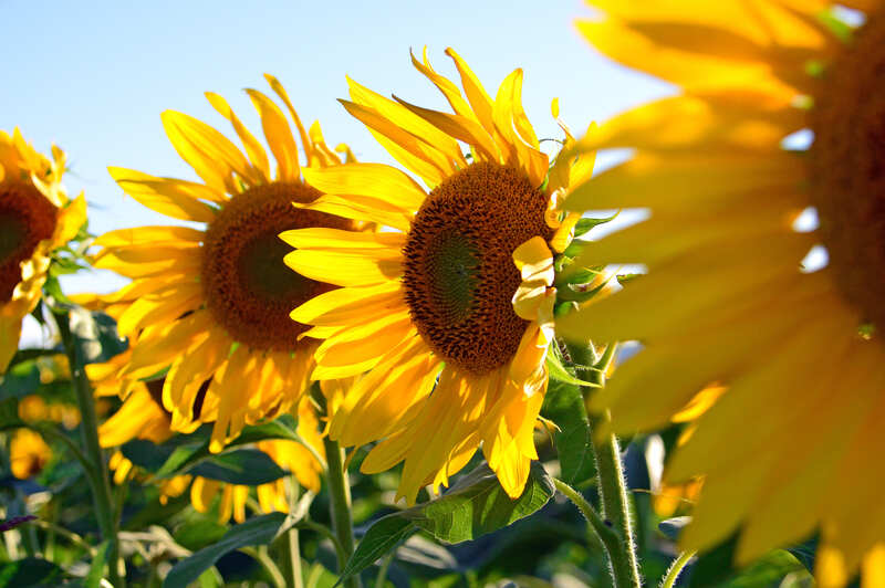
- Sunflowers
- Black-eyes Susans
- Daffodils
- Pansies
Green flowers
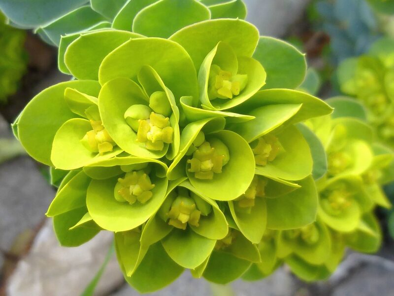
- Bells of Ireland
- Gladiolus
- Dianthus
- Green daylilies
Blue flowers
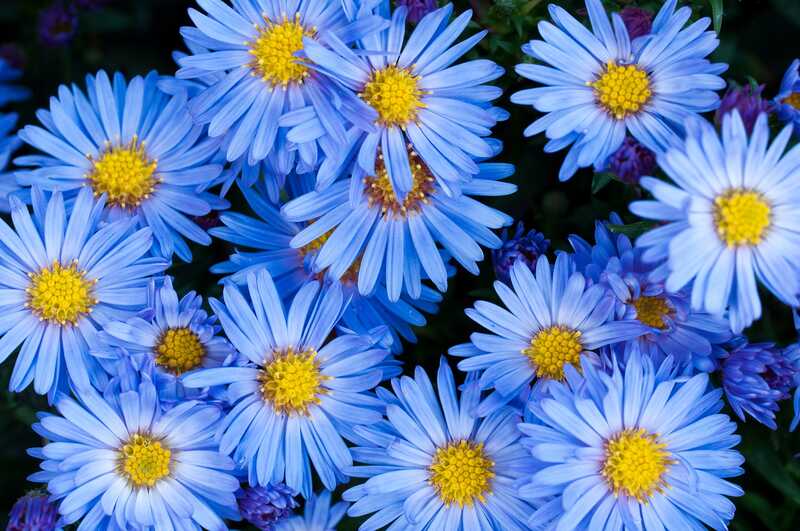
- Morning glories
- Texas bluebonnet
- Hydrangea
- Grape hyacinth
Purple flowers
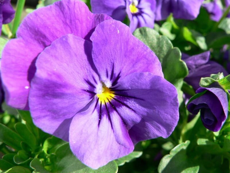
- Violets
- Irises
- Lavender
- Bellflowers
White flowers
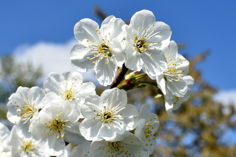
- Periwinkles
- Snowdrops
- Peonies
- Orchids
Color Your World
Is your landscape lacking color? You might’ve put it off because you weren’t sure where to start. Hopefully, with the basics down, you will feel more confident pulling the trigger on the landscape of your most colorful dreams.
If you know you want bluebonnets and violets but don’t know the first thing about plant care, hire a professional landscaper to bring your ideas to life and keep them alive and well. And don’t forget, a local lawn care professional can green up the lawn to help compliment those red roses!
Main Image Credit: Wonderlane / Flickr / CC BY 2.0